Goal:
Redesign of a flawed experience by identifying 3–5 core user and accessibility problems within the South African Government E-Government Portal.
Project overview:
Re-design the South African Government E-Government Portal / “gov.za” Citizen Service Page.
Aiming to evaluate whether the platform fulfils its intended purpose of providing user-friendly access to government services.
Research Question:
Can the average user navigate gov.za, and what are some key flaws preventing them from confidently completing a task?
Secondary Research
Problem 1: The Design–Reality Gap
Conclusion:
The South African government website does not fulfil its purpose in creating user-friendly accessibility to services, which will cause a potentially vulnerable user further unnecessary distress.
The website excludes users who rely on government services during high-stress situations such as unemployment, illness, or documentation issues, which are the very users this website is meant to serve.
Problem 2: Assumption of Privileged Users
Conclusion:
The website operates under the assumption that all users are unaffected by impairments, such as sensory, physical and intellectual, therefore do not cater to them.
The website also fails to account for people who use low-end devices, have limited data plans, and who struggle to navigate complex digital interfaces.
Problem 3: Legacy System Constraints
Conclusion:
The website’s accessibility does not account for users with low digital literacy, their assistive needs or network connectivity.
Research Summary and Design Implications
The above-mentioned findings expose systemic accessibility and usability failures, which directly informed the re-design priorities of this project, which will focus on reducing cognitive load, supporting low-bandwidth environments, and improving accessibility for users with diverse needs.
Comparative Analysis
Widely considered to be the “gold standard” for its commitment to accessibility & plain language.
Consolidated hundreds of separate departmental and agency websites with one coherent domain, which significantly reduces confusion and navigation burnout for users.
The platforms design prioritizes simplicity and accessibility, making the platform usable for users with low digital literacy as well as vulnerable users.
Thoughts on gov.sa
This portal lacks an accessibility-first approach, this negligence increased visual load, confusion, and difficulty utilizing essential services, which highlights opportunities for simplification, easier navigation and improves accessibility support.
Rationale for Research Focus
“Now, Minister of Communication and Digital Technologies, Si Maladzi says his department has launched a digital transformation roadmap to establish a single digital identity for all South Africans to access all government services. Maladyi says South Africa needs to catch up with other major economies and countries that have converted government services to digital.”
The above quote was taken from SABC News, given that South Africa’s minister of communications and digital technologies himself said that South Africa’s digital government services needs to essentially catch up with other countries, we can safely infer that our current digital government services, are lacking.
In a statement reported by SABC News, the minister of communications and digital technologies acknowledged the need for South Africa to close the gap on digital transformation endeavors, in order to adhere to international standards and to improve current accessibility to government services.
This acknowledgement from a government official, highlights the fundamental challenges that exist within the digital government platforms, this only strengthens the justification for evaluating the current gov.za platform, and measuring its performance against superior international government platforms.
Therefore, this project adopts a secondary research comparative research approach, focusing on publicly available information and examples, in order to identify the gaps within the South African government portal.
1. Selected Core Task:
Finding unemployment or social grant information on gov.za.
Why this task specifically:
People tend to access this information during times of financial stress.
This service can be convoluted, and the users may have low digital literacy.
Users may be utilizing low-end devices with limited data.
If a user makes an error or is confused about how to proceed with the services, it can have devastating real-world implications.
2. User Scenario:
An unemployed user who hasn’t had a stable job in the past three years, visits gov.za using a low-end smartphone and limited mobile data.
They are under a lot of stress and very anxious about the future, which is further exacerbated by the uncertainty of which department or service to utilize.
Their goal is to understand what support is available to them and what steps to proceed with.
3. Translating Research:
Design Goals:
Reduce cognitive load for users under stress.
Lay information out in clear and concise language.
Prioritize task-based guidance as opposed to department-based navigation.
Limit heavy visuals in favour of supporting low-bandwidth environments.
Make all following steps clear and actionable from the get-go.
Ideation:
H1 Title :
"Find Support After Losing Your Job"Body text :
“We’ll help you find the right government service.”Three stacked Primary buttons :
Apply for unemployment benefits (UIF)
Find social grant information
I’m not sure where to start
Divider
Help section :
“Need help?”
“Call the Department of Labour”
“Visit your nearest labour centre”
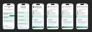
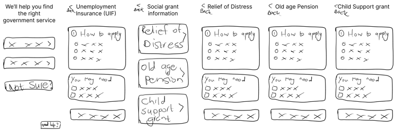
Low Fidelity Prototype:

Pros:
The structure repeats consistently across services
Low literacy friendly
Low data friendly
Older-user friendly
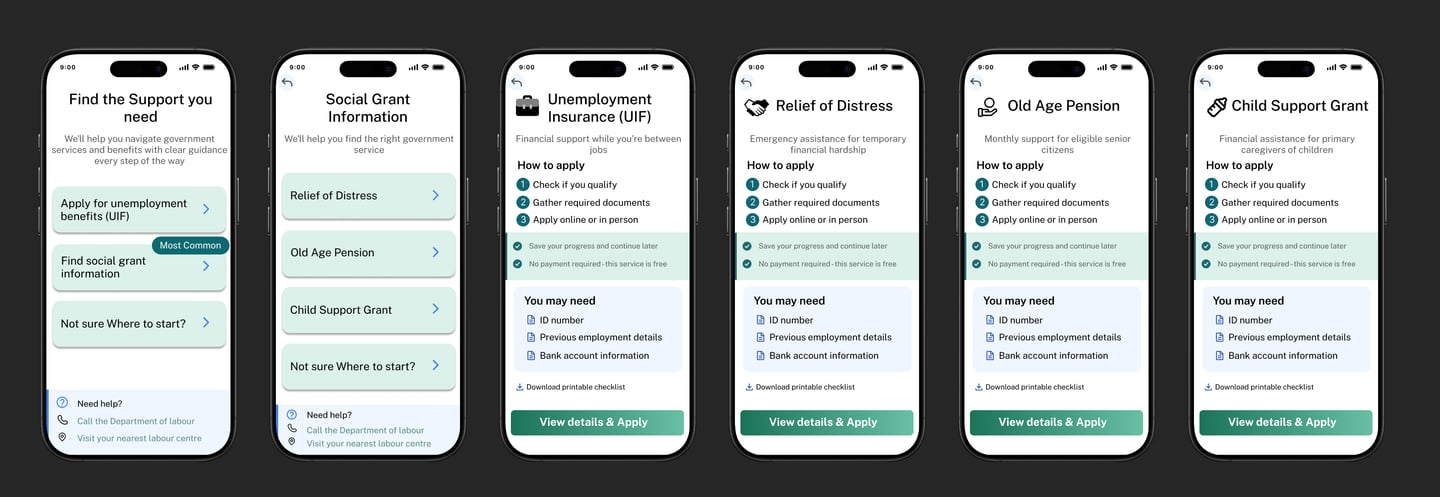
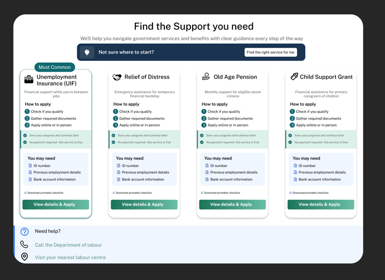
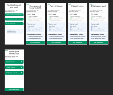
1. Clearer service differentiation
Low-fi issue:
All services (UIF, Relief of Distress, Old Age Pension, Child Support) looked and read very similarly.
Users had to infer whether a service applied to them.
Final improvement:
Each service card now includes:
A clear descriptor (who it’s for / what it’s for)
Stronger visual grouping per service
Users can quickly self-identify the correct service without reading everything.
2. Improved entry-point decision making
Low-fi:
Users chose between a few broad CTAs (“Apply for UIF”, “Find social grant info”, “Not sure where to start”).
Logical, but still cognitively demanding for stressed users.
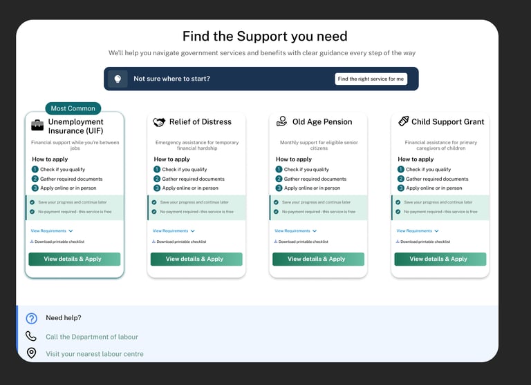
Final:
Services are now presented as scannable cards
Each card clearly communicates:
Eligibility cues
Required effort
Next step (“View details & apply”)
3. Stronger information hierarchy & scannability
Low-fi:
Information blocks existed, but everything carried similar visual weight.
Users needed to read more carefully.
Final:
Clear visual hierarchy:
Title → Purpose → Steps → Requirements → CTA
Improved spacing, alignment, and grouping
Headings and lists guide the eye naturally
4. CTA clarity and intent alignment
Low-fi:
“Start application” appeared early and could feel slightly premature.
Final:
CTA language is now more supportive and accurate:
“View details & apply”
Users are encouraged to understand first, then a
5. Better handling of eligibility anxiety
Low-fi:
“You may need” appeared early and felt rigid.
Risked intimidating users who lacked documents.
Final:
Requirements are:
Clearly grouped
Framed as preparatory, not blocking
The flow reassures users that this is informational, not final
6. Low-bandwidth support is now intentional, not hidden
Low-fi:
Offline / low-data options existed but blended into the layout.
Final:
Low-bandwidth support is:
Clearly surfaced
Consistently placed
Treated as a first-class feature
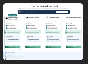
7. Consistent interaction patterns across mobile & desktop
Low-fi:
Mobile-first thinking was strong, desktop wasn’t defined yet.
Final:
Mobile and desktop designs:
Share the same mental model
Adapt layout without changing meaning
Cards, CTAs, and hierarchy behave predictably across breakpoints
8. Reduced cognitive load through visual grouping
Low-fi:
Content existed linearly.
Final:
Use of cards, sections, and containers:
Improves comprehension
Prevents overwhelm
Users can focus on one service at a time
9. Improved navigation confidence
Low-fi:
Back navigation existed but was abstract.
Final:
Page relationships are clearer:
Users know where they are
Users know what happens next
Navigation supports exploration, not just task completion
10. Overall tone shift: from functional → supportive
Low-fi tone:
Correct, efficient, neutral.
Final tone:
Clear, calm, reassuring.
The design acknowledges that users may be:
Stressed
Uncertain
Emotionally vulnerable
Improvements: